Soldier Boy's Descent Case Study

August 21, 2012


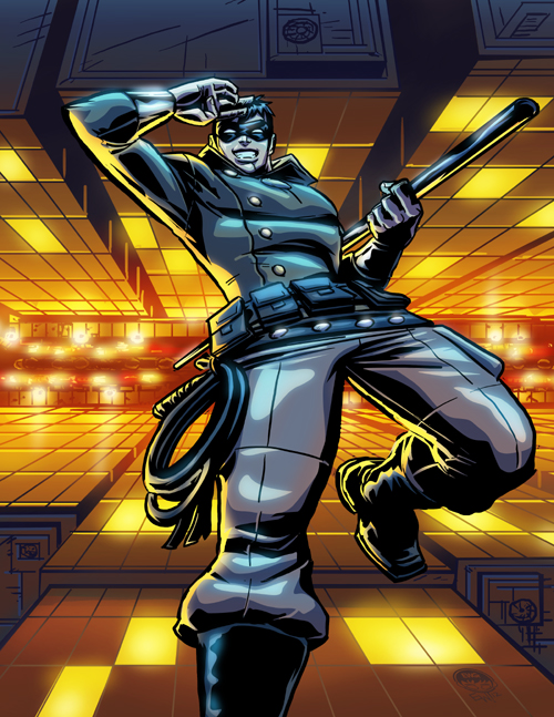
Presenting a quick case study of the process i went through to create this piece I've dubbed while working on it, "Soldier Boy's Descent", where he rebelliously jumps from the roof of a tall building to say 'see ya' to enemies who thought they otherwise had him. Or do a big splash exit after saving the night. Well heres how it went:

Started with 8.5x11 canvas per usual w/ .125 bleeds included (so a 8.75 x 11.25 canvas), sketched loosely figured out the perspective angle i wanted and the veneral pose/ layout.

Articulated some tight sketch enough to ink over and to send a proof to the customer, at this point i just blocked out the building to render in the inking stage.
Sketch approved I get inking, and knock the pencils to a very low-transparency and ink the character, using straight edge tool for big straight objects like this staff, and later the entire background

I make a quick fill mask of the figure so i know generaly his place over the background, and set that to very low transparency. With the figure inks turned off, i make a new layer, and render the background with pen tool and brush tools. The street level i purposely just suggest cars and a median with trees and light posts as the lack of articulation and detail simulates blurred focus putting more depth and focus on the figure.

I make a white flat layer behind the figure to seperate him from the background and later will use it to put colors behind the lineart. The figure and background are inked on different layers so i can later set the lineart of the background to a lighter color than black to make it set back and increase the depth as well as the focus on the character

Again, turning off the character ink lines and just using the flat color on a low opacity so that i can tell where he generaly was and not worry about spending a lot of time on details behind him, I make a layer under the background lineart and color it up! Good to use photo reference via google or what not to get it at least semi accurate. Little things like how theres a blunt end to the lighting from the street at the top edge of the building and it proceeds to reflect the sky not the street (hence the dark blue huges for the tops) and how in most photos, the contrast of any lights with the dark of the night causes it to bleed a bit and be extra 'glowy'. Also, a little reference for the movement of car head and taillights on low shutter speed was helpful.

Background done, I generaly know there will be orangy/yellowy light coming from the street and the moon lit lighting coming from the sky, so there are two sources of light to portray on the figure. I start by using that flat layer behind the figures lineart, and start seperating the flat colors of his jacket, pants, belts and boots and skin. Then on a layer above that i use an adjustment layer after selecting the entire figure, and fill it blue, and use layer modes to get a general desaturation effect that one gets at night, where colors are much more muted and almost black and white. I select areas that i want the shadows to fall on, using curves and being noteful of the shape of the object i'm doing the shading on. Then i add another layer overtop and select highlight areas from the street below, and another layer to do highlight areas of the moon light. I'll sometimes (as in this case) take one of the highlight layers and copy it, move it ontop of the lineart and set a gaussian blur to it to create a glow/ sheen effect. Play with the transparency at that point to get it as subtle or bold as you want. 

Turning the character and background lineart layers off and turning on all other layers is a good way to check for any color blemishes and check the lighting without the hard lines skewing the view of them. Everything looks good!

And here we have the finished art, at this point i save the psd version, then flatten it and save a jpg version, and then i have an action set to crop to an even 8.5x11 from all sides, (trimming off the bleed) and its ready to send to the customer! I also have an action set to save a lowres 500px wide 72dpi which i use for anything i'm going to post online on deviant art or this website.

Hope you enjoyed this casestudy, and walk through. Maybe you learned something? Maybe not? Anyways thank you for looking and taking the time to study it a little :) I appreciate the interest in what I do!

AM Warmup 8212012

For the All Tooned Up art group theme this month. Two themes, batman villains and venture bros, decided to do some Brock Samson from venture bros. hes always fighting some big beast with a knife. Gotta love him! This was 15-20 min so didn't really finish out beyond this. Still, was fun. On to finish some client work rest of the day!

Joe Kubert Tribute - TOR artwork by Eryck Webb

August 18, 2012


Originaly posted at the art group I enjoy participating in as often as possible, The Comic Art Alliance. This week's theme is tribute to the legend Joe Kubert whom just passed away this past month. I can say I've always found his work even though sometimes very loose, to have masterful technique in his storytelling and a certian fluidity to his work as well. Loved the way he drew faces and hands too. Well here is one of his intellectual properties he did many stories of over his years, TOR the caveman type character published I believe by DC comics or something like that. Reminds me of a tarzan type character, except with cool long triangle shaped hair and more hide on his arms and actual boots. Plus bonus caveman tools for hutning and clobbering. BONUS! This is also the first piece I worked on/ finished on my new Dell 24'' screen that tilts verticly allowing awesome massive close up into my work and makes working on verticle pieces a pure delight as its not cropped by a horizontal screen but you can see top to bottom way more. Great for pages, single panels and verticle character works! Barely scratching the surface in using it as I just got it as an early birthday present this week, but so far thrilled with it. Here is in continuing this tribute piece, and for those who come see this art on my blog, a look at the process. The original loose sketch, the loose but more definitive pencils over top, and the inks straight over top. I did it in my own style but tried to channel some joe kubert in the inks with a angled calligraphic brush instead of a normal round brush. Gave it a cool aesthetic. But still doesn't beat the inking i've been doing lately in Inkscape, and its FULLY tunable brushes. Enjoy, and heres to Joe Kubert... a legend and inspiration. I'm glad I can say I've read a few of your Tarzan comics, studied your work through searching for it through google, and even visited the Joe Kubert school when I was looking at colleges back in the day. He is a great loss to the cartooning/ comic community but I know his two sons are already working hard to carry on the mad comic skills.

~Eryck

Loose sketch to get the posture/ attitude/ form down

Tighter pencils, just fleshing out enough to ink over, not finished pencils by any means!


The inks w/ black fills by themself!

Then felt like doing some blue hue colors for the 'colors' Finished version at top :) Thanks for looking

Done in tirbute to JK and for CCA

C.A.T Mascot Horizontal Finished

August 7, 2012

Got the production on this mascot design for the band Continuous Audio Transmission completed. All vector via photoshop object drawing and masks, pdf looks perfect no matter how far i zoom in and print test came out perfect too. Looks crispy! A new landmark in technique and graphic level for EWG for sure! Lunch and then character commissinos rest of the afternoon. Good stuff. Check out CAT's stuff, info and music samples here


April O Neil Ghost Buster Start to Finish on Livestream

August 6, 2012


Did tonight's $20 commission live on livestream. Was of a Ghostbusters Original Character of the customer's that was cosplaying as April O Neil from the 80s TMNT cartoon, but had to go on a mission with no time to change so it looks like April Oneil is a ghost buster hehe. Fun combo to do. Thanks for those who came out to watch, saw ya in there. And for those who didn't heres the recorded session. From starting sketch to finished colors/ effects and color tweakings. Enjoy!


Zombie Reader - Finished Commission

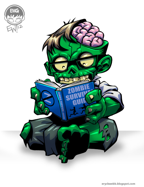
Fun character art commission of a zombie reader, w/ some freedom to design the zombie as long as it was reading a 'zombie survival handbook' looked a bit nerdy and had some brain showing to show he was smart. Apparently a literate zombie! Did it in vector (completely vector, even the shades... new technique i just figured out) in photoshop, i have inkscape which i used to use a lot but i find it very counter intuitive and using objects in photoshop and saving out as vector data works SO much better. Lossless gradients and highlights and shadows and line edges baby. Anywho... fun stuff! Done for today. Going to get the wifey from work and stuff. Will do today's $20 commission later tonight.

So you want an outline of my logo commission process....

August 2, 2012


So, heres a new one. Somebody before jumping in wanted to know about my whole process, SURE mister. Be happy to relay that to you. So you can either copy what I'm doing in your own business or waste my time typing it out and probably not even buy anything at the end anyways. HAPPY TO HELP! But heres hoping he decides the water isn't too fridged and if he has a clue what he wants for a logo specificly then I'll be happy to help.
Howdy, I'm interested in potentially having you design a logo for me. I was wondering if, before I decide, you could walk me through your design process in terms of my input and the # of variations you may design. Best, Jeremy
So I replied, with this break down, which covers all the important points, and hopefuly this will be useful for anybody else looking to have a logo done and wondering how it works. Cause I'm sure most people think ' i toss my moneys in the wishing well called 'paypal' and hope my finished perfect magical logo will appear to me under my pillow tonight!'
1. You pay 45.00 which i invoice from paypal, and then you pay +2.00 paypal fee 
2. You tell me what your looking for on your logo, symbols that represent the org the logo is for, as well as the name of the org 
3. In about one week I shoot you 3 solid varying ideas. in black and white unless you have specific colors locked down and i will do them in those colors from the start
4. color variations to lock down colors with the one you picked to continue with from the 3 ideas.
5. wrap it up i bundle files send to you.
6. if job is finished and you come back with changes post-sending files, i will bill you for 15.00 each time you do this.
7. if for some reason you hate the first three ideas, i will try again, and if you hate those, will try one more time before refunding your money and sending you on your way. 

Anywho, happy to break it down for any ol' customer out there. But just a few tips here... saying things in your introductory prospective contact email like 'how many variations are you willing to design' and 'potentially interested but before i decide i'm interested'.

Silly Bastards...

Comic Strip - 'Head Start'


A comic strip I thought of this morning, based on a true story. Alrighty, thought I'd share hehe.

Zombie Reader Pencils Proof

August 1, 2012

Well after doing the previous sketchy sketches here: http://eryckwebb.blogspot.com/2012/07/zombie-nerdy-bookworm-sketchin.html I tackled it again tonight in the sketchbook with traditional pencils and hacked out this little guy. I feel like, it could be taken further pose/ design wise. But I'm pretty content. I think I will call it a proof and it has been sent :)

C.A.T mascot and logo render work in progress


8/1/2012 - 4:45pm - Finished the 'transmission tower' for the Continuous Audio Transmission logo. Heres a close up shot with a nav panel shot of the whole thing on the side. Pending final approval but I think the guys will love it. Came out better (to me) than I imagined.

8/1/2012 - 230pm First look at a work in progress shot of very early rendering of the Continuous Audio Transmission mascot. A cyber cat that retains the same industrial feel of the rigging of their logo etc. Still a long way to go. Will be more details on the head etc. Making it absolutely perfect so may not get done today.

 
EryckWebbGraphics © 2013 | Base Template Designed by RumahDijual, in collaboration with Online Casino, Uncharted 3 and MW3 Forum
Design Modified and Adapted for Eryck Webb Graphics Website by Eryck Webb.